Longtime readers of this blog may know that I talk about fonts sometimes: in particular, when the city put up some ugly new street signs with a variety of typefaces and sizes on them (they looked horrible.)
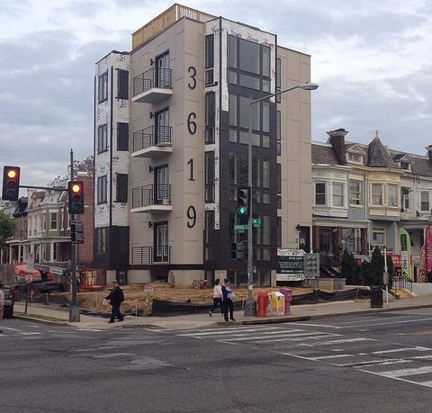
And something just caught my eye: this condo building at 14th and Spring Rd NW has some giant address numbers on it, probably five feet tall, and they look really bad.
I guess it’s good to try something new with your building, but these look like the address numbers you buy for a buck at the hardware store — the cheapest ones they have. If you’re going to put huge numbers on an otherwise fine looking building, which are presumably pretty expensive, why not get attractive or modern-looking ones?
There are certainly bigger things to complain about, but then again, what’s life without little annoyances?


