Look up: our new street signs look like crap.
A few weeks ago, I read in the Post that DC street signs would be getting a new font and would be written in title case, rather than upper case (that is, Fairmont Street rather than FAIRMONT STREET). They’re also going to write the numbers as ordinal numbers, as in “14th Street” rather than the current “14 Street.”
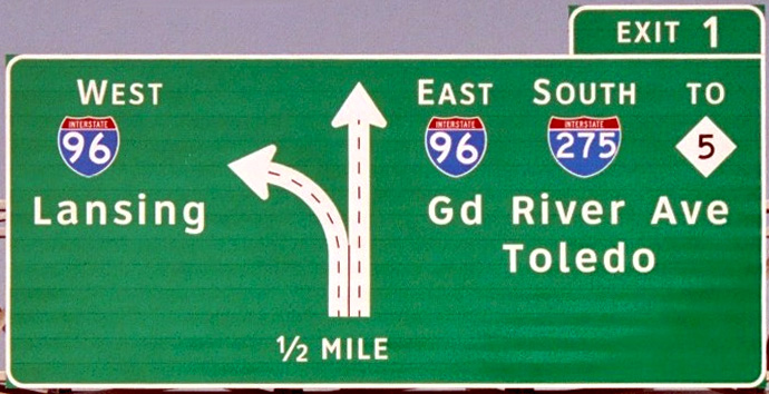
I’ve seen the font, which is part of new Federal standards, before on highway signs in other parts of the country, and always liked them. However, on some signs I spotted near the Georgia Ave-Petworth Metro, it looks really bad. I think the city got it wrong.
Check out the sign to the right for new Hampshire Ave and the one below for Georgia Ave. The New Hampshire sign uses three different sizes: the “ew” in New is bigger than “ampshire” in Hampshire. It shouldn’t be that way, and it looks terrible.
Aside from that, more things are wrong. Compare the “G” in the sign for Georgia Ave to the sign below in Michigan using the font: they’re not the same. And the lower case letters in the DC signs are way smaller than they should be: “eorgia” and “ampshire” are less than half as large as the upper case letters, while in the Michigan sign, they’re more than 2/3 the size of the upper case letters. (In typeface lingo, upper case letters are called majuscule, and lower case are miniscule.) Furthermore, the quadrant is written as Nw, when it should be NW.
What’s odd is that Mike DeBonis from the Post snapped a picture (bottom right) of new and old East Capitol Street NE signs on Capitol Hill, and everything looks correct. It appears that somebody messed up when they made these Georgia and New Hampshire signs.
Now I know street signs are a minor issue in the grand scheme of things, but man, do they look awful.
UPDATE: To be clear, I think this is the wrong font. The lower case g in Georgia is another example: compare it to Clearview, the font it’s supposed to be.


